
Transform Your Space, Elevate Your Life.
ABOUT SOPHISTICASA
At Sophisticasa, we believe that a well-lived life goes beyond the confines of four walls. We embrace the spirit of adventure and seek to infuse every aspect of our lives with inspiration and a touch of sophistication.
Our mission is to empower you to transform your home and lifestyle into a sanctuary of beauty, creativity, and bold exploration.
A Better Home For a Sophisticated Life
We are a community of individuals who are passionate about embracing an inspirational and adventurous lifestyle within our homes and beyond. We are are seekers of beauty, sophistication, and meaningful experiences, driven by a desire to infuse our lives with a sense of elegance and exploration.
OUR BLOG
Choosing the Perfect Color Palette for Every Room
Color plays a major role in home design. It influences how a space feels, how large or small it appears, and how comfortable it is for everyday living. While furniture and decor contribute to a room's character, the color palette serves as the foundation that ties everything together.
With countless shades and combinations available, selecting the right palette may seem overwhelming. A thoughtful approach can help create rooms that feel inviting, functional, and connected throughout the home.
Start with the Purpose of the Room
Every room serves a different function, and color choices should reflect that purpose.
Living rooms are often gathering spaces where family and friends spend time together. Warm neutrals, soft earth tones, and muted greens can create a welcoming atmosphere without feeling overwhelming.
Bedrooms benefit from calming colors that support relaxation. Soft blues, gentle greens, warm grays, and subtle beige tones are popular options for creating a peaceful environment.
Home offices often require a balance between comfort and focus. Colors such as sage green, muted blue, or warm taupe can help create a productive setting while maintaining visual comfort during long work sessions.
Dining rooms can handle slightly bolder colors. Deep greens, warm terracotta shades, or rich navy accents can add personality and create a memorable dining experience.
Consider Natural Light
Lighting significantly affects how colors appear throughout the day.
Rooms with abundant natural light can support darker or more saturated colors without feeling cramped. Sunlight enhances color depth and can make bold choices appear vibrant and balanced.
Spaces with limited natural light often benefit from lighter shades that reflect available light. Soft whites, warm creams, pale grays, and gentle pastels can help brighten darker areas.
Before committing to a color, test paint samples on multiple walls and observe them at different times of the day. Morning sunlight, afternoon brightness, and evening artificial lighting can all change the appearance of a color.
Create Flow Between Rooms
A home feels more cohesive when colors transition naturally from one room to another.
This doesn't mean every room should be painted the same color. Instead, select a palette that includes complementary shades. For example, a warm beige in the living room may connect beautifully with a soft sage green in the kitchen and a muted blue in the bedroom.
Repeating certain undertones throughout the home helps create consistency. Warm-toned colors generally work well together, while cool-toned shades can create a seamless flow when carried throughout different spaces.
Understand Color Temperature
Colors are often categorized as warm or cool.
Warm colors include shades with red, orange, and yellow undertones. These colors can make spaces feel cozy, welcoming, and energetic.
Cool colors contain blue, green, or purple undertones. They often create a calming and refreshing atmosphere.
Neutral colors can lean either warm or cool depending on their undertones. Understanding these subtle differences can help prevent clashing colors when decorating multiple rooms.
Use the 60-30-10 Rule
One popular interior design guideline is the 60-30-10 rule.
60% of the room consists of the dominant color, usually walls and larger furniture pieces.
30% serves as the secondary color, often found in upholstery, rugs, or curtains.
10% acts as the accent color, introduced through accessories, artwork, or decorative objects.
This approach creates visual balance while allowing enough variation to keep the room interesting.
Don't Overlook Neutrals
Neutral colors remain a favorite for good reason.
Shades such as beige, cream, taupe, gray, and soft white provide flexibility and longevity. They work well with changing decor styles and make it easier to update a room over time.
Neutrals also create an excellent backdrop for artwork, statement furniture, and decorative accents. Even when using bold colors, incorporating neutral elements can help maintain balance.
Draw Inspiration from Your Decor
Furniture, textiles, artwork, and flooring can all provide valuable color inspiration.
A patterned rug may contain several colors that work beautifully together. A favorite piece of artwork can guide an entire room's palette. Natural materials such as wood, stone, and woven fibers can also influence color selections.
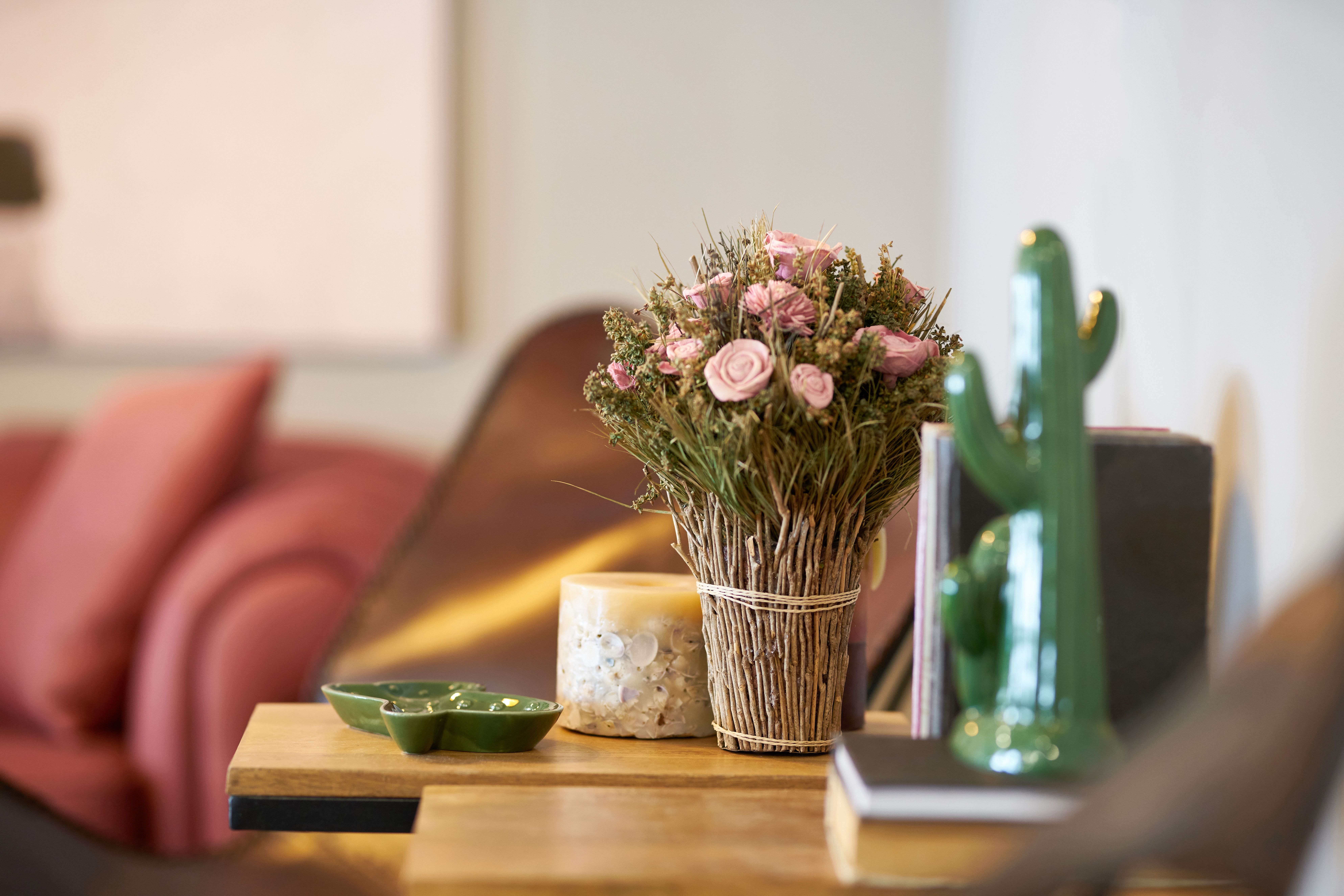
For homeowners seeking inspiration and carefully curated decor pieces, it's worth taking a look at Zoco Home. Their collection features natural textures, earthy tones, and thoughtfully designed home accessories that can help shape a cohesive color scheme throughout the home.
Popular Color Palettes for Different Styles
Scandinavian Style
Soft white
Light gray
Natural wood tones
Muted black accents
This palette creates a bright and clean appearance while maintaining warmth.
Coastal Style
Sandy beige
Soft blue
Crisp white
Seafoam green accents
These colors create a relaxed and airy atmosphere inspired by the coast.
Modern Organic Style
Warm beige
Clay tones
Olive green
Charcoal accents
Natural shades help create a comfortable and grounded environment.
Contemporary Style
Soft gray
White
Black accents
Muted earth tones
This palette offers a clean and sophisticated appearance without feeling sterile.
Test Before Making a Final Decision
Paint colors often appear different on a small swatch than they do on an entire wall.
Purchase sample sizes and test them in the actual room. Observe how the color changes throughout the day and how it interacts with flooring, furniture, and decor.
This small step can prevent costly mistakes and help ensure satisfaction with the final result.
Think Long-Term
Trends come and go, but wall colors are not something most homeowners want to change frequently.
Selecting timeless colors for larger surfaces allows flexibility with furniture and decorative accents. Trend-driven colors can still be introduced through pillows, artwork, throws, and other accessories that are easier to update.
A balanced color palette should feel comfortable and appealing not only now but for years to come.
Choosing the perfect color palette involves more than selecting favorite shades. The function of the room, available lighting, existing furnishings, and overall design goals all play important roles in the decision-making process.
With careful planning, a well-chosen color palette can create beautiful spaces that feel connected, comfortable, and visually balanced throughout the entire home.
One or more of the links above are affiliate links, meaning, at no additional cost to you, we will earn a slight commission if you click through and make a purchase. Each of these products is chosen by a trusted member of our team.

Email: partnerships@sophiticasa.com
Site: www.sophiticasa.com