
Transform Your Space, Elevate Your Life.
ABOUT SOPHISTICASA
At Sophisticasa, we believe that a well-lived life goes beyond the confines of four walls. We embrace the spirit of adventure and seek to infuse every aspect of our lives with inspiration and a touch of sophistication.
Our mission is to empower you to transform your home and lifestyle into a sanctuary of beauty, creativity, and bold exploration.
A Better Home For a Sophisticated Life
We are a community of individuals who are passionate about embracing an inspirational and adventurous lifestyle within our homes and beyond. We are are seekers of beauty, sophistication, and meaningful experiences, driven by a desire to infuse our lives with a sense of elegance and exploration.
OUR BLOG
Choosing the Right Palette to Transform Your Living Space
When it comes to home decor, color is one of the most powerful tools to transform any space. The colors chosen for walls, furniture, and accessories influence mood, perception of size, and even daily energy levels. Selecting the right palette for a living space isn’t just about personal taste; it’s about how colors interact with light, texture, and each other to create harmony and balance.
Understanding Color Psychology
Different colors evoke different emotions and reactions. For example:
Blue often creates a calm, serene atmosphere—ideal for bedrooms or bathrooms.
Yellow brings warmth and energy, brightening kitchens or dining rooms.
Green connects with nature and can refresh a living area or study.
Red is bold and stimulating but best used sparingly to avoid overwhelming a space.
Knowing how colors influence mood helps in choosing hues that fit the intended function of each room.
Warm vs. Cool Colors: Setting the Tone
Colors generally fall into two categories: warm and cool. Warm tones like reds, oranges, and yellows create cozy, inviting spaces. They tend to make rooms feel smaller but more intimate. Cool tones such as blues, greens, and purples open up a room visually and impart a feeling of calmness.
If the goal is to make a compact room appear larger, cool colors on walls and ceilings can help reflect more light and create an airy vibe. On the other hand, a large room with too much empty space can benefit from warm shades that add comfort and reduce the sense of vastness.
How to Build a Balanced Color Palette
A successful color palette usually follows the 60-30-10 rule:
60% of the dominant color (typically wall paint or large furniture)
30% of a secondary color (upholstery, rugs, or smaller furniture)
10% of an accent color (decorative pillows, art, or accessories)
This balance prevents a room from feeling overwhelming while allowing pops of color to stand out.
Using Neutrals as a Foundation
Neutral colors like beige, gray, white, and taupe create a versatile backdrop that pairs well with nearly any accent color. Starting with neutrals allows for easier updates by swapping out accessories or paint without the need for major redecorating. Neutrals also help maintain a clean, sophisticated look.
Lighting’s Role in Color Perception
Natural and artificial lighting greatly impact how color looks in a room. A shade that appears soft and warm in sunlight might look dull or harsh under fluorescent bulbs. Always test paint samples and fabric swatches in different lighting conditions before committing. This step avoids surprises and ensures the colors selected perform well throughout the day and night.
Tips for Applying Color to Furniture and Decor
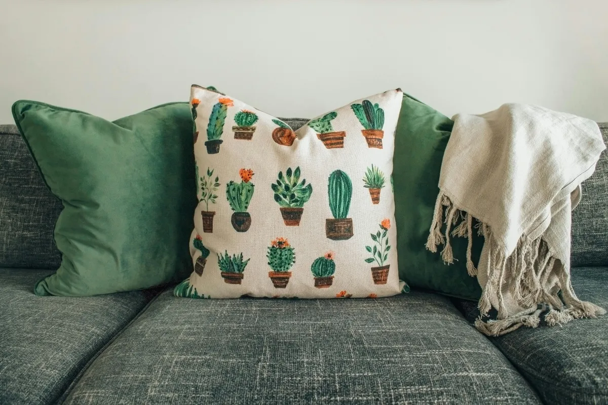
Walls are just one canvas—furniture, curtains, rugs, and artwork provide excellent opportunities to layer color. Consider how these elements complement or contrast with wall colors. For example, a neutral sofa can be brightened up with vibrant cushions or a colorful throw. Bold furniture pieces can serve as statement items when balanced with muted surroundings.
For anyone looking for stylish furniture or unique decor items that help pull a color scheme together, checking out Zoco Home is a smart choice. Their collection offers carefully curated pieces that fit a wide range of color palettes and interior styles, making it easier to find exactly what’s needed to enhance any room.
Color selection isn’t just about what looks good—it’s about how the space feels and functions. Taking time to understand color effects, experimenting with samples, and balancing tones will transform living spaces into environments that support daily life beautifully.
One or more of the links above are affiliate links, meaning, at no additional cost to you, we will earn a slight commission if you click through and make a purchase. Each of these products is chosen by a trusted member of our team.

Email: partnerships@sophiticasa.com
Site: www.sophiticasa.com