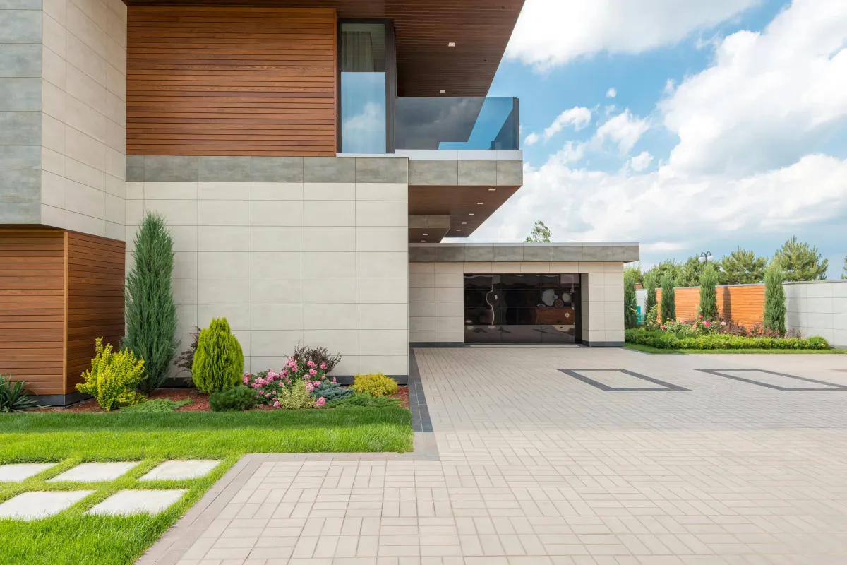
Transform Your Space, Elevate Your Life.
ABOUT SOPHISTICASA
At Sophisticasa, we believe that a well-lived life goes beyond the confines of four walls. We embrace the spirit of adventure and seek to infuse every aspect of our lives with inspiration and a touch of sophistication.
Our mission is to empower you to transform your home and lifestyle into a sanctuary of beauty, creativity, and bold exploration.
A Better Home For a Sophisticated Life
We are a community of individuals who are passionate about embracing an inspirational and adventurous lifestyle within our homes and beyond. We are are seekers of beauty, sophistication, and meaningful experiences, driven by a desire to infuse our lives with a sense of elegance and exploration.
OUR BLOG

How to Choose the Perfect Exterior Color Palette for Your Home
Choosing the right exterior color palette can dramatically improve your home’s curb appeal and create a welcoming atmosphere. Beyond aesthetics, the right palette also reflects your style and highlights architectural features. Whether you’re planning a full repaint or simply refreshing accents, careful color selection makes all the difference.
1. Understand Your Home’s Architectural Style
Your home’s design style often guides the best color choices. Traditional homes may suit classic tones like whites, creams, or muted greens, while modern designs work well with bold contrasts and sleek neutrals. Research your home’s architectural era for ideas that naturally complement its structure.
2. Consider the Surrounding Landscape
Take cues from the environment around your home. Shades of earthy browns, deep greens, or sandy neutrals can harmonize with trees, gardens, and nearby buildings. A palette inspired by natural elements creates a balanced look that feels connected to its surroundings.
3. Work with Three Main Colors
A balanced exterior palette typically uses three colors:
Main Color: The dominant tone for walls or siding.
Trim Color: A contrasting or complementary shade for window frames, doors, and gutters.
Accent Color: A bold or eye-catching hue for doors, shutters, or architectural details.
This structure helps keep the design cohesive while allowing creativity.
4. Play with Undertones
Even neutral shades have undertones. Grays can lean warm or cool, and whites can appear creamy or crisp depending on lighting. Test color swatches in both sunlight and shade to see how they shift throughout the day.
5. Use Sample Patches Before Committing
Painting small sections with your chosen colors before covering the whole exterior helps you see how the palette works in real-world conditions. Look at the sample patches at different times of day to ensure they work in every lighting scenario.
6. Highlight Architectural Features
Exterior color can enhance or soften specific design elements. Use a slightly darker or lighter tone to make features like window frames, eaves, or shutters stand out. This approach adds depth and visual interest.
7. Coordinate With Furnishings and Outdoor Spaces
Color palettes don’t stop at the walls—think about patio furniture, outdoor lighting, or door hardware. Cohesive tones between these elements create a polished, unified look. This is also a great time to explore pieces from Zoco Home, which offers stylish home furnishings that complement a wide range of exterior color schemes.
8. Think Long-Term Maintenance
Darker shades may show fading or dirt more quickly, while lighter shades can highlight stains or discoloration. Consider your local climate and maintenance habits when making your final choice.
9. Add a Pop of Personality with Doors or Shutters
Even with a classic or neutral base, front doors, shutters, or trim are perfect areas to introduce vibrant shades. A bold color here can give your home a signature look without overwhelming the main palette.
A well-chosen exterior color palette enhances both curb appeal and personal expression. By considering architecture, environment, and undertones, you can create a cohesive and timeless look that works for years to come. And with the right furnishings and accents from places like Zoco Home, the result feels complete inside and out.
One or more of the links above are affiliate links, meaning, at no additional cost to you, we will earn a slight commission if you click through and make a purchase. Each of these products is chosen by a trusted member of our team.
Email: partnerships@sophiticasa.com
Site: www.sophiticasa.com
